Building a Design System for Seamless Rebranding
Tools
Figma
Storybook
Tokens Studio
Background
When I joined Lano, my first big task was to conduct a UI audit of the old platform. The audit showed many problems, and the biggest issue was inconsistency. Although the technology allowed creating web components for UI elements and reusing them throughout the platform, the development team didn't do it consistently. Sometimes, it was easier for them to create a component from scratch instead of finding one for reuse. This led to duplicates that looked or even behaved differently, causing confusion for users.
Challenge
When the decision was made to build Lano 2.0, we already knew that implementing reusable UI components wasn’t enough. We also needed a component library that would make it easy to keep track of the existing components, update and test them. Our plan was to make a design system that would become a source of truth for the whole team. Additionally, it was decided that a complete UI overhaul, including a rebranding, was necessary to address the outdated look of the old UI.
My Role
Led the creation of a design system
Ensured its consistency and easy maintenance
Integrated updates into the design process
Assisted frontend team in transferring styles and components to the web library
Participated in the testing process
Process
Component Creation
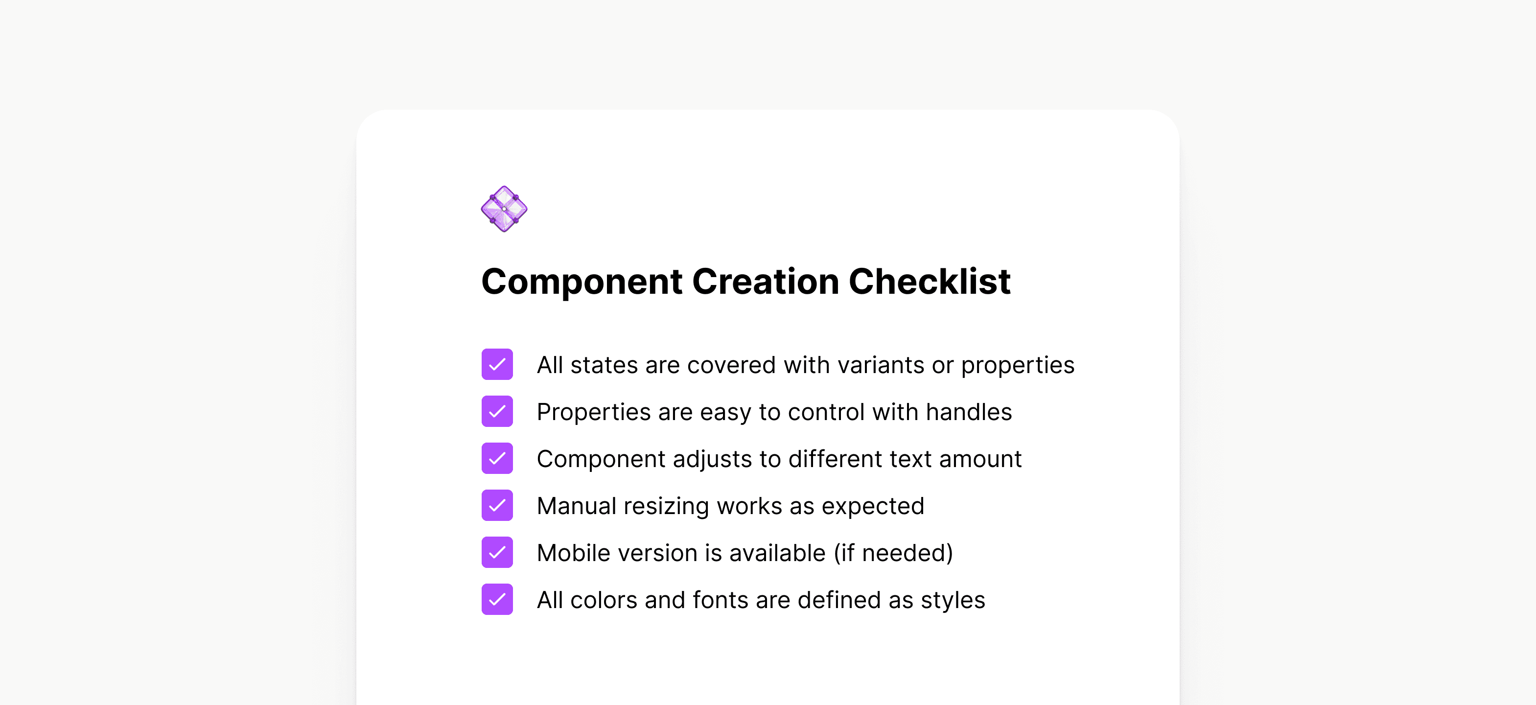
I was responsible for adding any new components introduced by our designers to the mockups. This involved clarifying the intended behavior with the designer in charge and working on its states, mobile version, and corner cases. Once it was completed, I passed the component back to the designer for updating their mockups.
Documentation
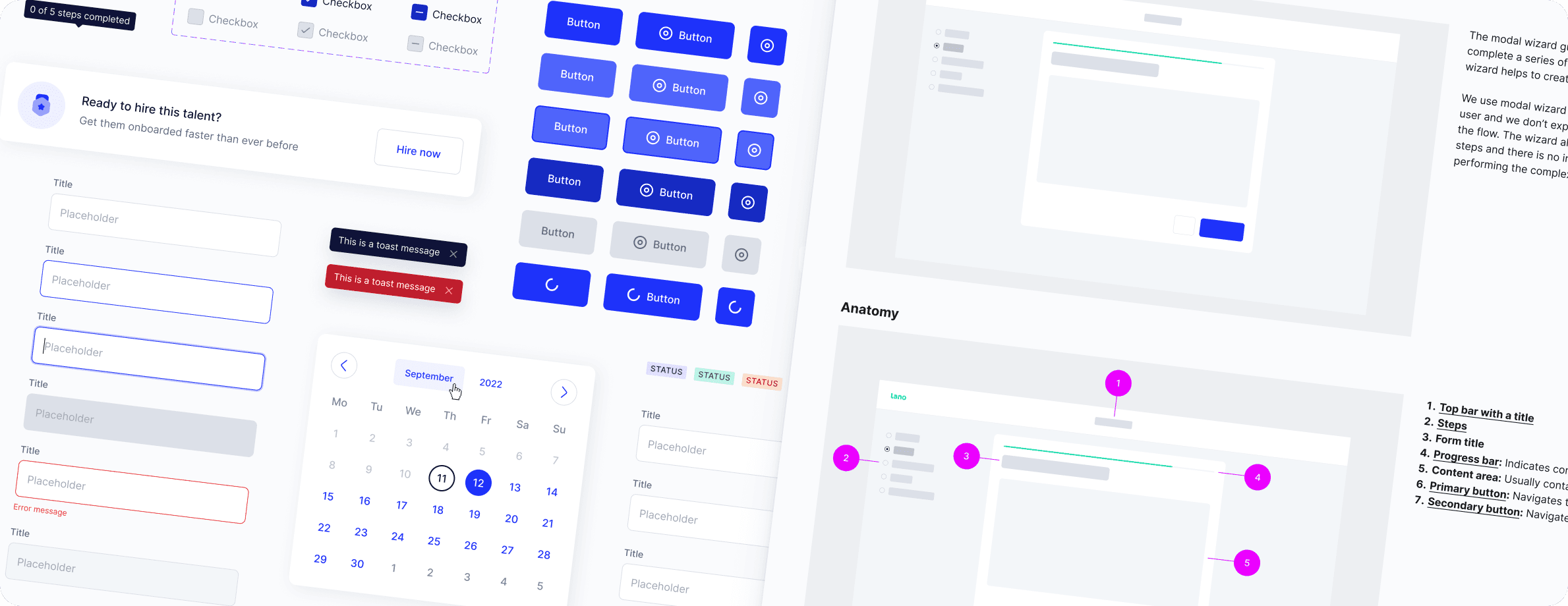
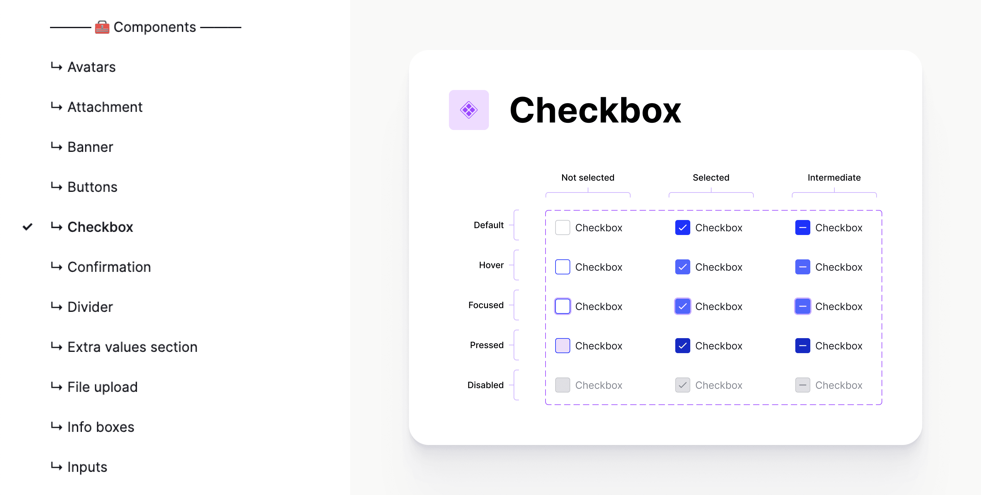
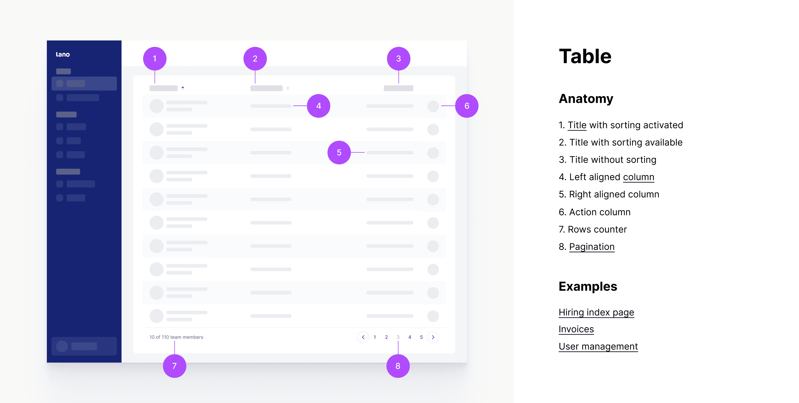
Guidelines for each component were created showing its use cases, constraints and sizes. For most components I marked up sizes and margins using tokens to streamline the implementation process. Also, I explained how the element should react to cursor or other input from a user and how it should be animated.
Implementation
Typically, a new component was passed on to implementation as part of the design flow, rather than in isolation. This allowed developers to see how the component behaved within the interface and how it related to other elements on the page. The handoff process included the following:
A design flow that demonstrated how the new component was used.
A link to the design system where all the different states of the component were specified.
Guidelines that provided detailed specifications and markup instructions for implementing the component.
Testing
After the new UI element was added to the library in Storybook, I verified if it matched the design and behaved as intended in various scenarios. Sometimes developers didn’t have enough time to populate the Storybook library. In such cases, the UI element had to be checked directly in the interface using the inspect mode in Chrome.
Updates
Updates to the design system were published once a week to avoid interfering with other designers' workflow. Before publishing the updates, I held a meeting with the design team to announce the upcoming changes and get team approval. After publishing an update, I went through the files affected by it to make sure the layouts hadn’t shifted and components hadn’t lost their text and icon overrides.
Structure
Styles
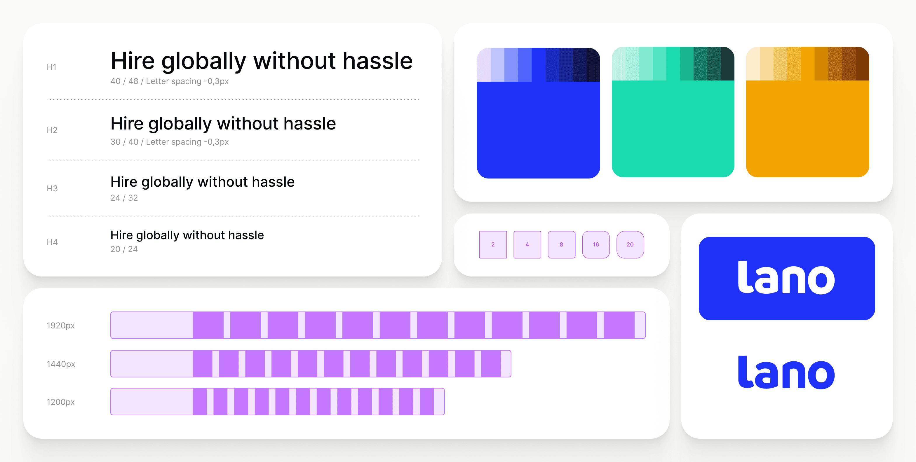
The section includes variables such as colors, margins, fonts, and corner sizes. It serves as a visual reference, allowing everyone to easily view the basic parameters of our design system.
Components
The components section is organized similarly to the library in Storybook. Each page represents a component with the same name as in the library.
Patterns
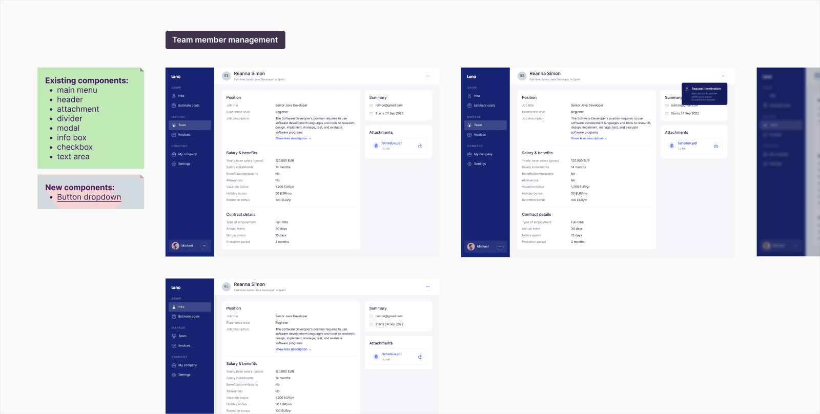
Patterns are essentially examples that demonstrate how components interact with each other. Here, you can find examples of pages and additional states, such as empty states and skeletons.
Tokens
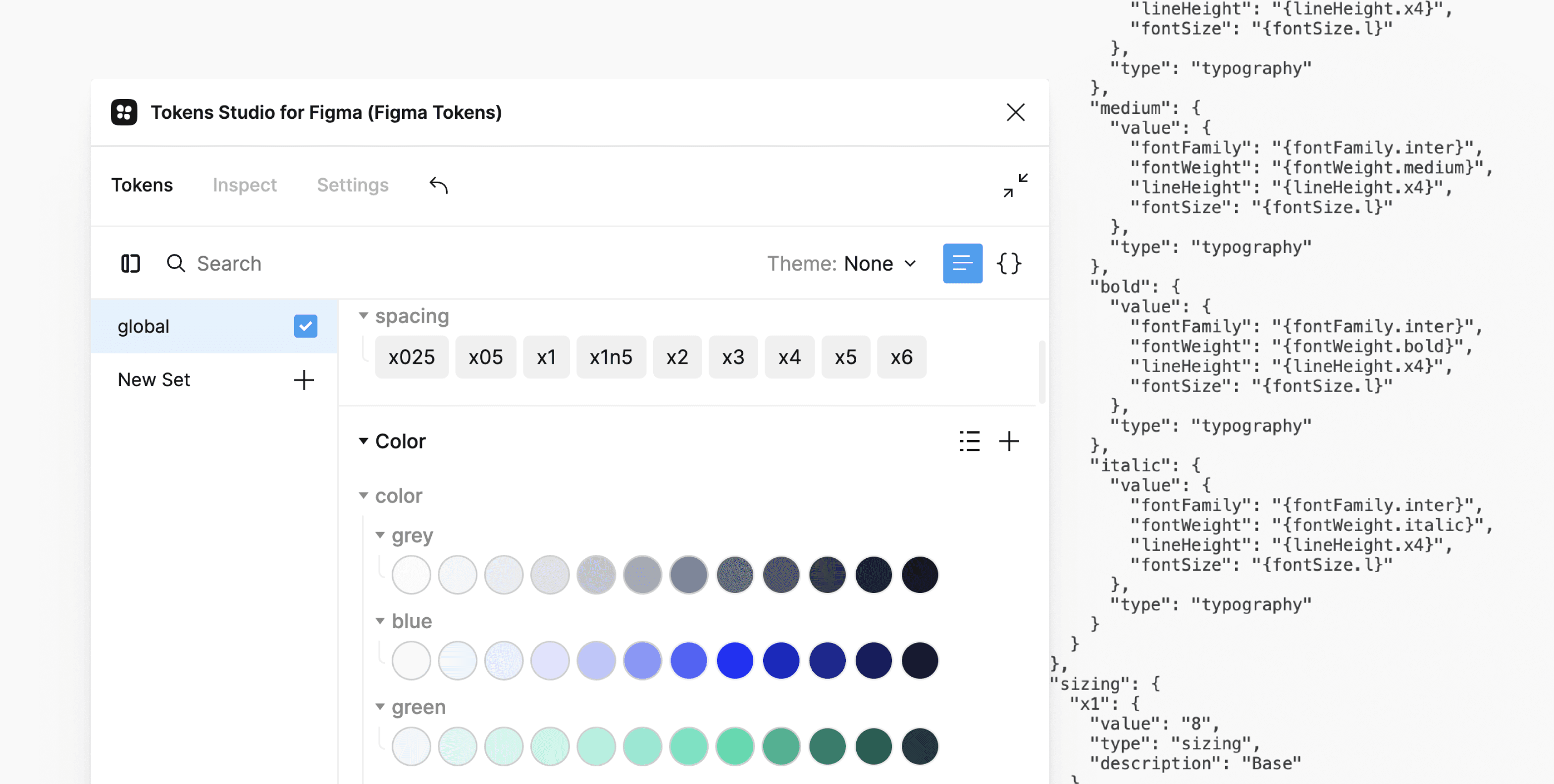
In our design system, we used tokens to encode important values such as colors, fonts, margins, and sizes. This approach allowed us to easily make design changes to the platform by simply updating the token values, which in turn automatically updated all associated styles.
Icon library
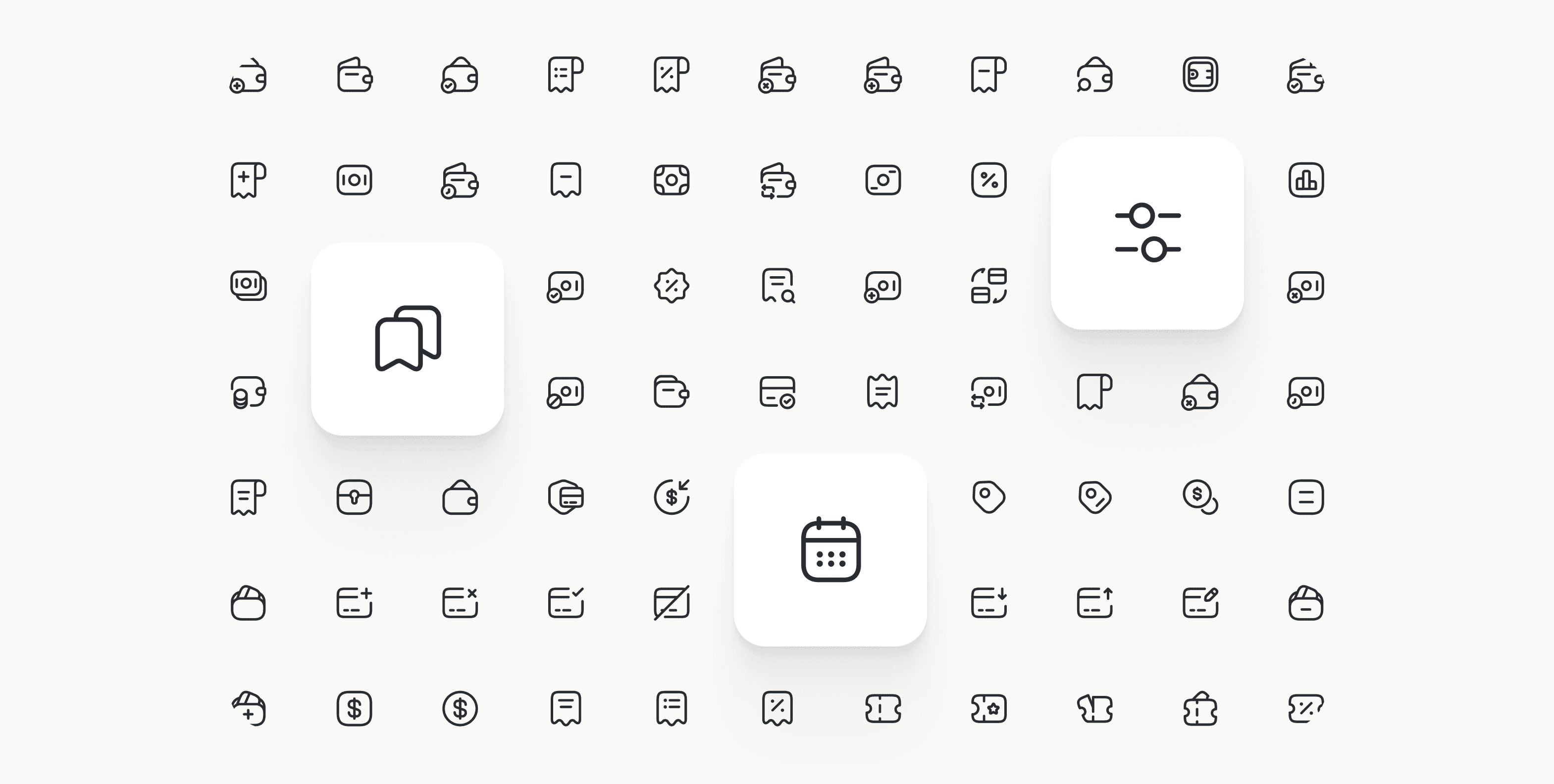
To improve efficiency and consistency in our design process, we utilized an external icon library, which allowed us to quickly choose from a variety of pre-designed icons that aligned with our design system. By integrating the library into our components, designers could easily select suitable icons from the component properties, saving time and ensuring a cohesive style.
Reflection & learnings
During this project, I learned that without good communication, the implementation can deviate significantly from the initial vision. Explicit documentation is valuable but developers may still overlook it. So, even more important than guidelines was to have a good working relationship with the development team. This encouraged them to reach out with any questions they may have. Additionally, I proactively checked in with them to offer assistance.
Equally important was staying on the same page with the design team. While designers influence how the design system evolves, updates to the design system in turn affect the designers' workflows. We regularly organized sync-ups to keep the team informed about the changes that occurred.
